bryantcodes.art

I'm Bryant! (he/him)

I build web experiences

About

Mission

I am a freelance dev who helps awesome designers (like you) build their wildest dreams.

Together, let's create something that stands out––and has your users saying, "woah."

Testimonials

  • Bryant's kickass work is complemented by his infectious energy and passion for creating original, exciting work. He is a true creative partner––always bringing new ideas to the table.
    Stephanie Jung,Brand Design Lead, Employer Marketing at Handshake
  • Bryant's collaborative mindset and aptitude to explore ideas well beyond the minimum viable product make him an invaluable partner.
    JP Ramirez,Design Manager, Brand Design Strategy at Intuit, Director, Studio Ramírez
  • Bryant's building enables award-winning projects––including CSSDA Special Kudos, CSSDA Best UI/UX/Innovation, 4x STA100, Type Director's Club, Webby, Webby For Good... & more.
    The award people,

Skills

  • 7 years working with best-in-class designers building award-winning projects
  • strong command of design systems. excellent at interpreting mockups in any form (adobe, figma, whatev) and working with minimal OR maximal direction
  • exceptional at visual styling and attention to detail. whatever tool it takes: CSS, SCSS/PostCSS, Tailwind, animation, 2D & 3D rendering...
  • expert communication & project management. leading up, down, and laterally. transforming chaos into launches
  • full stack & at the cutting edge. this site is built with React/NextJS, Typescript, Sanity, Three.js/R3F, GLSL, and a laundry list more
  • always accessible, functional, responsive, compatible, performant and search engine optimized

Projects

  • Handshake

    2 years co-building a premium corporate marketing site with 100k+ monthly traffic

    Client
    Handshake
    Design
    • Handshake Design Team

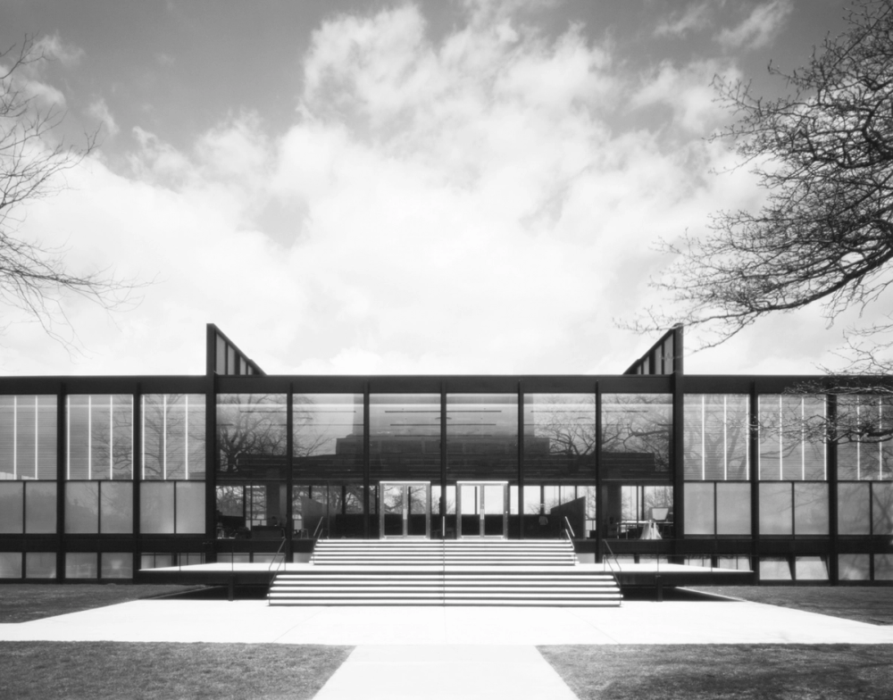
    Handshake is a FAST growing multi-million-dollar tech company focused on improving equity in career opportunities for students.  When we first met, they needed a from-scratch rebuild of their marketing site for an imminent rebranding announcement–and they needed it fast. 

    Love at first site

    This project required a skilled developer–but also a strategic thinker.  They needed a project managerial mind who could take ownership of the situation, manage laterally, self-unblock, and navigate the diverse needs of multiple stakeholders across four departments.  In short, they needed someone who could tame the beautiful, dynamic chaos of a fast growing startup into a successful launch–on a deadline.  I came recommended as a pinch hitter who could wear all the hats needed to get the job done.

    Despite a harrowing timeline, our first launches saw double digit improvements in conversions.  It was so successful that I stayed at Handshake as a contractor for two years, co-owning the development of joinhandshake.com on a two-person dev team.

    While I ultimately decided to part ways and more deeply pursue creative tech freelancing, this experience taught me how to go above and beyond serving a fast-paced, complex corporate team at scale.

    All the hats

    Working with several teams of designers and strategists, I built dozens of pages & microsites, shepherded rebrands (full and partial), and even coached some design contractors new to web design on best practices.  When I saw the business needs were changing, I proposed and spearheaded a site-wide full stack tech migration to reduce costs, increase development speed, and create a better experience for content managers. I helped build Algolia search experiences, Marketo integrations, animated data visualizations, and even a user-facing interactive image editor.

    A senior in a growing dev team

    As a larger marketing dev team began to form toward the end of my tenure, new dev leadership trusted me with senior tasks. I owned our tooling/ops, conducted technical intervews, delegated and reviewed junior contributions, coached our team on new tech & best practices, built in-house libraries, and even added an e2e/visual regression testing workflow by my own initiative to help the team manage a rapidly scaling marketing site.

  • Next Is Now

    A simulated computer desktop that transforms from past to future

    Client
    Handshake
    Design

    Handshake needed to get the attention of the nation’s top student-facing recruiters with an eye-catching experience. The “Next Is Now” promotional campaign would show how far the recruiting field had come by 2021–and position Handshake as the nextgen tool of choice.  Lead designer Stephanie Jung had the awesome idea to build an old-school 90’s desktop that would transform into a modern system in front of the recruiter’s eyes, reinforcing themes of transformation and old-to-new.

    I was looped in because the team was investing heavily and this experience had to be sick.  Many prototypes and some fun with glitch animations later, the launch knocked it out of the park!  Handshake saw a huge return on its investment–growing its clientbase and reputation.

    Game of Life

    The microsite features a unique animation as the background transforms from dithered gray to blue-green gradient.  In my prototyping, I was inspired by John Conway’s “Game of Life.”  I divided the screen into a large matrix of square pixels.  On page load, each GUI item on the page “competes” to grab territory–claiming as many adjacent squares as it can until the page is fully divided up.  When an item is triggered to transform, a random tile beneath it is deleted.  Each animation frame, the neighbors of a deleted tile will delete themselves according to a carefully tuned set of rules–repeating until all of the tiles in the item’s territory are deleted.  The result is rendered in real time in WebGL via PIXI.js.  With a little randomness and a differently-sized matrix depending on the screen size, the animation is never the same twice!

    CSS glitch transitions

    Each GUI item on the desktop is styled twice–with two different sets of CSS styling code. One for old, one for new.  CSS is really good at tweening between different styles!  While we usually choose gradual, smooth transitions to tween, you can also specify bouncy zigzag cubic bezier functions.  A function like this will slingshot the styles to an overexaggerated place and back before finally arriving!  Combine this zigzagging tween function with a different randomized delay and duration for every single styling property, and you get this fun glitch effect!

  • Typeforce 12

    A jiggling, tuggable, interactive "12" using physics simulations

    Client
    Typeforce
    Design

    Typeforce, an annual typographical art exhibition, has a reputation for being wild, engaging, innovative and experimental–all while simultaneously being prestigious in the world of type.  They needed an outlandish and cathartic microsite to announce their first physical exhibition since the start of the pandemic. The page would both promote the event and solicit artist submissions.

    Will Miller and Nermin Moufti envisioned interactive jiggling blob glyphs that the user could pinch, tug, and throw around the page. They were worried this was a bit… ambitious. But they also knew this sort of thing was my jam and I’d love the challenge.  (They were right. I wouldn’t allow them to walk back their idea.)  Simultaneously, with a target audience of font all-stars and enthusiasts, they knew they could trust me to execute the page’s typography and layout perfectly.

    The launch was a hit–propelling the event’s buzz and yet again solidifying Typeforce’s place in the world of off-the-wall typography. The exhibition was packed with both people and world class art–and I was humbled to hear there was buzz in the crowd about this crazy announcement page.

    How to make a twelve jiggle

    After trying many different solutions and tech stacks, we finally found a winning recipe. We used a physics engine (matter.js) to simulate springs anchored along the borders of each glyph.  The springs would wiggle freely as the user interacted and then we would feed their wiggling coordinates into a 3D renderer (three.js). There, those points were used to redraw the glyphs each frame in WebGL–at a smooth 60fps.  Turns out, a series of wiggling springs is a good approximation for the surface of our jiggling blob.  While I wrote this code independently with different tools, I learned this clever spring technique directly from Yuriy Artyukh’s amazing demo–which I found after researching many alternative methods to get this effect. (Creative devs, his work is AMAZING!)

    Ping-ponging

    Something like this can’t be fully mocked up in Figma–the end product has to arise via collaboration between designer and developer. This is my favorite part of the process. 1. Take a designer’s wild “what if” as a challenge. 2. Attempt to capture the essence in a prototype. 3. Have really fun conversations where the designer layers on new ideas, reactions, and feedback. 4. Repeat (a lot) until fully baked.

    Back and forth.  Ping, pong.  We spent a LONG time ping-ponging to get the 12 just right–and I regret nothing.

  • Typeforce 9

    An abstract 3D geometrical scene featuring a dynamically shattering 9.

    Client
    Typeforce
    Design

    Typeforce, "an annual exhibit celebrating wildly talented, emerging typographic artists and designers," has a tradition of announcing its shows with playful, experimental, cutting edge microsites.  At the time, Typeforce was operated through Firebelly Design, where designer Tom Tian was eager to explore 3D abstraction and I was developing a reputation as the dev who liked to build all the crazy things.

    Craftspersonship

    Sometimes a design vision is open–inviting creative collaboration and exploration. Other times, the designer has already architected it down to the last detail in their mind’s eye –simply waiting for a skilled craftsperson to build it with precision.  I love the challenge and growth provided by both ends of the spectrum.  In this case, Tom had his world masterfully premeditated–from the geometry, to the reflection imagery, to even the camera’s field of view.  It was exhilarating to try to keep up with him!  Nudging angles. Adjusting animation speeds by percentage points.  Every detail matters because, as I’ve observed working the high-calibur design thinkers, a tiny adjustment can have a massive impact!  When I reflect on this project, I’m most proud of how a compelling and tasteful 3D experience emerged from our meticulous attention to detail and care for Tom’s original vision.

  • UIUC School of Art + Design Exhibition

    In uncertain times, an award-winning digital celebration of student art

    Client
    University of Illinois
    Design

    The University of Illinois had a crisis.  With the pandemic canceling their physical exhibition, they needed a digital experience to showcase their students’ art. For a design program with a reputation to maintain, an ordinary cookie-cutter gallery site wasn’t gonna cut it.  This needed to impress.  Enter JP Ramirez, a program alum and veteran brand designer.  JP found me in the search for serious dev muscle to precisely execute and technologically empower his vision.

    We launched to resounding critical praise–delivering an award-winning site, helping U of I make a statement in a troubled time, boosting program morale, and doubling as an evergreen showcase that, to this day, still promotes the program and attracts new students.

    A (carefully) randomized grid

    JP envisioned a homepage with a dynamic, randomized pattern of student art and his custom typography glyphs strewn about the brand's grid system. We had a blast collaborating over many prototypes to find just the right version technically and aesthetically (creatively leveraging CSS Grid and GreenSock).

    An animator's dream workflow

    We wanted to showcase interactive vector animations for every glyph in JP’s typeface. With 26 characters, each with multiple animation states, motion designer Andrew Reaume was on the hook for 100 high quality animations. All on a timeline!  So, we created a workflow leveraging the Lottie.js vector animation framework. Andrew could build his animations in After Effects and export them directly into my code where they would be rendered as performant vector animations (with their different in, out, hover, etc. animation states triggered appropriately). This allowed him to move quickly and guaranteed perfect execution. Frequently staged previews let him see how his work looked on the actual site at every stage of his process. He could iterate as much needed to get things just right–with almost no additional dev costs.

    Content, content, content

    To date, thousands of art entries have been cataloged across the exhibition sites we created.  That scale of content entry via CMS is a substantial labor–often by stakeholders who should be focusing on more critical business tasks.  So, we implemented a time-saving automation pipeline to batch add hundreds of entries at a time into the CMS–by importing a google docs spreadsheet.


  • IIT College Of Architecture Open house

    A web experience inspired by the architecture of IIT's renowned Crown Hall

    Client
    Illinois Institute of Technology
    Design
    • Jeffrey Wigen
    • Elanderi Steyn

    The first student exhibition since the start of the pandemic! IIT College of Architecture needed an impressive digital gallery experience to celebrate this moment. They wanted high-concept, magazine elegance executed with architectural precision. They also loved their backend content management system from previous years and wanted to keep the existing codebase. I was recommended as a dev who could deliver on their vision all while adapting to their existing tech–on a timeline.

    The blueprint

    Jeffrey Wigen and Elandri Steyn envisioned a homepage experience that payed abstract-but-tangible homage to Crown Hall, the beloved modernist building housing their college. Images of student artwork would load dynamically into geometries evocative of Crown Hall's rectangular windows–serving as a metaphor for the physical exhibition.

    A black and white image of IIT's Crown Hall–a symmetrical single-story facade known for the geometry of its rectangular windows.

    Wrestling browsers

    Due to an obscure bug in Safari's line rendering, we had to think outside the box to get our particular line animations looking great on all supported browsers. We tried many techniques, but ultimately discovered we got the best look by animating moving white lines ON TOP of a fully drawn black shape.

    So we're actually animating the negative space, rather than the lines themselves! And this made things a great deal more difficult to implement–but, for better and worse, I am a stubborn perfectionist and will go to great lengths to avoid compromising a designer's vision. (ESPECIALLY if it's a cool vision. lol.)

    Animating "perimeters"

    "Sometimes it’s at the edges that we do our best work," reads Jeffrey and Elandri's statement. Thematically, the exhibition "Perimeters" explored the heightened awareness of boundaries that characterized the pandemic. It would embody the artistic resilience shown by their students while drawing visual analogy to the linework of architectural design schematics.

    It's creatively really fun to have a strong conceptual motivation for animation work!

    The line segments that circle Crown Hall on the homepage are precisely sized to be evocative of the building shape when they first appear. In the next moment, they begin to rotate–and ultimately close during page transitions. On gallery pages, more playful linework cathartically dissolves as the user moves their mouse, encouraging exploration of student artwork.

Contact

hello @ bryantcodes.art